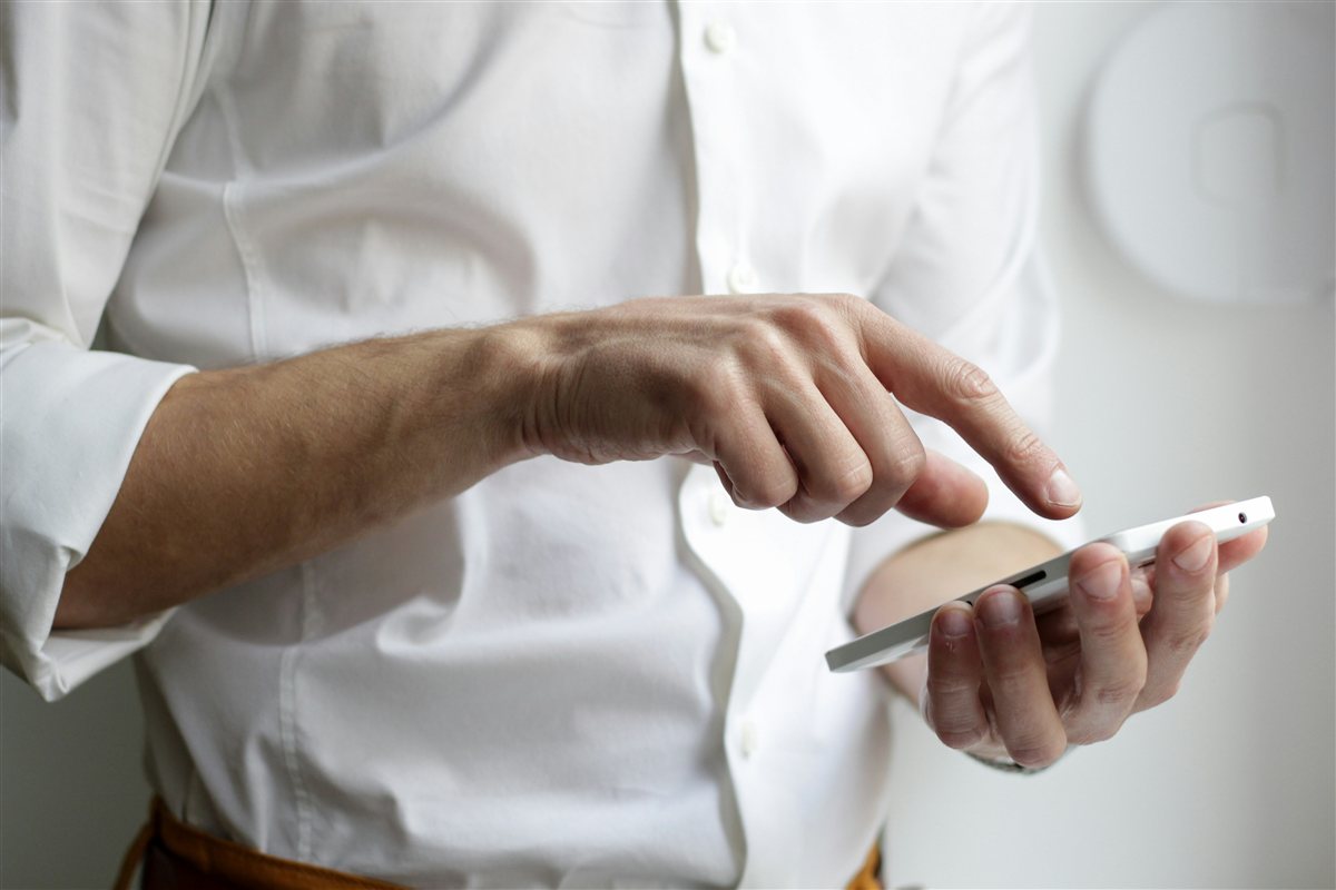
Most of your customers aren't sitting at a desktop when they find your website. They're on a phone — scrolling through a Facebook comment, tapping a link from a group chat, checking your site while they're out doing errands. That's just how people browse in the Philippines these days, and it's worth building your site with that in mind.
The good news is that making a site feel comfortable on a phone doesn't take a big redesign. It's usually a handful of small, easy details that add up to a much smoother experience. Here are the ones I check first.
Easy wins that make a real difference
Buttons big enough for a thumb
A button that's easy to click with a mouse can be frustrating to tap accurately with a thumb. Making buttons and links a bit bigger, with a little breathing room around them, makes browsing feel effortless instead of fiddly.
Contact info that's one tap away
If someone wants to call or message you, a phone number that's actually clickable (not just text) saves them the trouble of copying and pasting. Same with a Messenger or WhatsApp link sitting right where they can see it.
Photos sized for a small screen
A product photo that looks great on a laptop can end up loading slowly or looking oddly cropped on a phone. A quick resize before uploading keeps things looking sharp and loading quickly, wherever someone's viewing from.
Menus that don't fight the screen
A simple, collapsible menu (the kind that tucks away behind a tap) works a lot better on a small screen than a long row of links squeezed together. It keeps things tidy and easy to scan.
A simple way to check your own site
Try this: open your own website on your phone, using your regular mobile data — not your home wifi. Scroll through it the way a first-time visitor would. Can you tap what you need without zooming in? Is your number clickable? Does everything feel like it fits comfortably on the screen?
If something feels a little clunky, that's useful information — not a big problem, just a small tune-up waiting to happen.
A phone-friendly website isn't about doing everything perfectly. It's about making the handful of things people actually do — tapping, calling, scrolling, browsing photos — feel easy.
The honest model
When I build a site, I check it on an actual phone throughout the process, not just at the end. Buttons, contact links, photos, menus — I want all of it to feel natural on a small screen, because that's where most visitors will actually experience it.
The bottom line
Your customers are already meeting you on their phones. A few small, thoughtful touches make that experience feel easy and welcoming — and that's often the difference between someone browsing a little longer or bouncing off to check somewhere else.
If you'd like a second pair of eyes on how your site feels on mobile, that's the part I can help with.
Further reading
- Why Your Business Doesn't Show Up on Google — czerwin.net